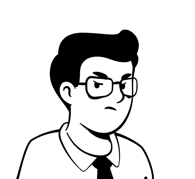
Microsoft's New Onboarding Experience
Concept for a new collaborative social feature in Microsoft teams.
Role
Founding Designer
Team
Founder + 14 others
Tools
Figma
Notion
Timeline
2024-Present
DISCIPLINE
UX/UI
Enterprise
shipped
Yes
Description
A concept about a voice based conversational agent to enhance the Hosting experience for Airbnb users.
MY ROLE
As a Founding designer, I owned the entire design for the Apiphany's Product — Research, UX/UI Design, Visual design, Customer Discovery and Team facilitation. I closely collaborated with the CEO, Director of Engineering, a team of 13 AI Engineers + Developers, and a freelance Graphic Designer.
CONTEXT
Working as a designer on a data heavy product at an early-stage startup involved tackling various design and personal challenges on a daily basis like navigating through uncertainty, designing rapidly, and constantly adapting to changing business vision and priorities. This case study is part of a big project — my latest work at an AI Stealth Startup in SF.
highlights
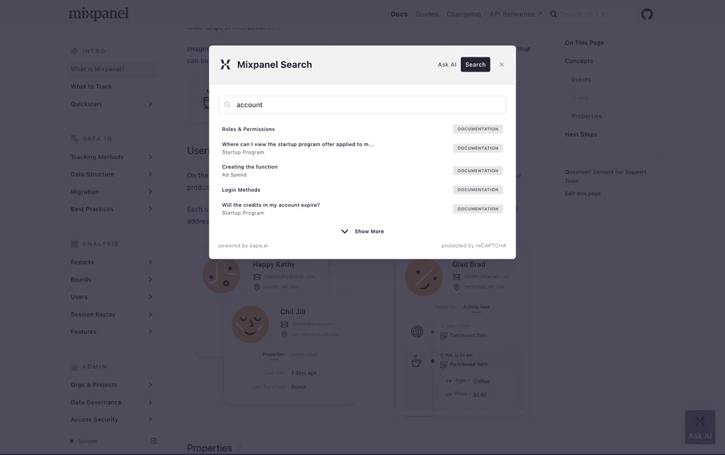
A powerful way to search complex data.

Natural language
search to handle complex queries


Natural language search with filters for information discoverability. Search Results that is easy for scan-ability and matches with the real world convention of our users (aka product engineers).
I created the entire style guide / design system for the product from scratch.
Challenge
Craft a Search Experience for complex data
How might we help engineers to find product engineering issues quickly and effectively?
I was provided with following needs and constraints:
Identify user problems in issue resolution processes.
Identify key data points, that could help users in resolving the issues.
Design an interface, test and validate.
constraints
Uncertainty, constantly shifting business vision, and priorities made daily tasks demanding.
Working as the sole designer at an early-stage startup in a new city posed its own set of personal and professional challenges. Honestly, it was quite overwhelming to start working on a brand-new product with no visual design foundation. With hopes, dreams, and ambitions of creating the most beautiful design that I have seen, often times, things were not looking that good, and I had to iterate constantly to meet the design standards that I set up for the product.
Working under strict deadlines as the only designer and 14 engineers, often meant shifting gears to constantly keep building. I struggled in the beginning and exhausted myself with the amount of work that I was producing each week. Later, I changed my approach and started with setting clear expectations each week, and then showing progress against them, hoping to build trust with my team on my way.
Work
Home
About
Contact
Key User Story
Product Engineers work without visibility into the processes.
As a Product Engineer, when I encounter an issue, I want to know how we tackled similar issues in the past so I can find validated solutions.
image: avatartion.com
Our users goal is to use the search function for 2 key tasks — to find open issues, and to find how they solved similar issues in the past.
Approach — With the goal to develop insight into why Engineers do what they do, I met daily with Subject Matter Experts (SME's) with a goal to understand the space and problems. This also meant I had to design things fast, producing solutions daily to get product feedback, create design documentation for engineers, share progress with the CEO and develop plan for next steps.
DESIGN Goal
Powerful, intuitive search experience.
It's pivotal to craft a positive impression by focusing on good usability heuristics, especially when designing for speed to reduce usability errors during testing.
Designing to match real-world conventions of our users (aka Engineers).
Translating unorganized data from customers into clear systems.
Ensuring the AI-powered feature to provide clear expectations and feedback on it's action.
INDUSTRY RESEARCH
Search Heuristics & Audit
Tooltips


Approach — I did an audit of 20+ Enterprise products, detailing everything from search term used, interactions, relevancy, placeholder texts, auto-suggest, auto-complete, number of results, sorting & filtering, error states, and more.
What I learnt — I learnt patterns in search UX like communicating intent clearly with placeholder text, brand voice, variety of auto-suggestions and auto-complete based on context, how filters are presented based on users need, and how well systems handle typos, and fuzzy matches.
approach
What's an ideal search experience?
Tooltips
Search
Query
AI Black box
Input
Result
System understands the intent perfectly & presents to the user the best results and informs them about possible solutions.
Find similar issues, resolutions, and create detailed scenarios.
Explanation — An ideal search experience is when users can find the correct result (issue resolutions) seamlessly, with minimum interactions.
design trade-offs & ITERATIONS
Crafting a Search Experience
Search is our core feature that lets users find past issues they’ve already looked at, but also discover new ones.

Search Components
Autosuggest and Autocomplete paired with natural language search
❌
❌


Natural language search
Issue summary with key info like status, stage, ID associated with each open issue.
Too many results associated with each component
✅
✅
Autocomplete and Autosuggest are great but not powerful to predict all user needs.
Natural language search enables users to ask complex queries but it is sometimes vague, and led to inaccurate results which hurt our user adoption.
Where Natural language could have worked? If this was a feature that we wanted to release for a mature product, we could have taken care of edge case by mentioning to the users that the results could be inaccurate, allowing users to experiment.
Engineering constraint: Inconsistent data among different components. Hence it is difficult to create right tags for NLP. The obvious solution is to use filters before the search.

Main Filters along with Search
❌
Natural language search
✅
Natural language search enables users to ask complex queries but it is sometimes vague, and led to inaccurate results which hurt our user adoption.
Where Natural language could have worked? If this was a feature that we wanted to release for a mature product, we could have taken care of edge case by mentioning to the users that the results could be inaccurate, allowing users to experiment.
Natural Language Input + Filters solved 2 problems for us — it educated users on how to use Natural Language Input and visualizing filters allowed users to not lose progress.
Search Results
What are the users trying to accomplish through the table?

Key categories
AI Search with auto-suggestions for customers — Ford Motors.
Filters
Cards are visually engaging and better suited for showcasing multimedia content and allow users to focus on one result at a time.
AI Capabilities: Helping users explore the limitations of AI Search during initial and early use so they build healthy AI habits & trust.
Tooltips
AI Search with auto-suggestions for customers — Ford Motors.
KPI's & RESULTS
Success Criteria & Results.
Query Success Rate
14/20 of beta users rated the results from the search feature as “highly relevant” or “perfect match”.
Task Success Rate
Task success rate improved from 20% to 85% after implementing new Search..
Satisfaction Score
Qualitative feedback showed that 8/10 users described the feature as “helpful” or “essential” to their workflow.
Unused ideas and rationale
Cards are visually engaging, better suited for showcasing multimedia content and allow users to focus on one result at a time, but it’s harder to directly compare items since details are spread out..
Cards are visually engaging and better suited for showcasing multimedia content and allow users to focus on one result at a time.
AI Capabilities: Helping users explore the limitations of AI Search during initial and early use so they build healthy AI habits & trust.
Tooltips
AI Search with auto-suggestions for customers — Ford Motors.
Granular UI problems
How can I allow a user to take an action without visually dominant UI elements?
I hypothesized variety of ways of solving this problem:
All text vs truncated text
Option 01 — Lighten the controls
With something like a drop down, if we lighten it, it looks like disabled.
Option 2 — Solve through interaction by making the actions available on hover. I actually like this solution quite a bit, but it has a tradeoff. It is less accessible since the accessibility tools wont be able to label all the buttons making it impossible to go to the buttons directly. However we can still solve this using keyboard shortcuts, and make the buttons available, but it is not an intuitive solution.
Option 3 — Kebab menu next to each row which is less dominant but it would work best for scenarios with multiple actions. For our use case, I needed a much simpler solution.
Option 4 — Integrated tags and dropdown
CONCLUSION & RESULTS
By focusing on a transparent AI search that "meets the users where they are at" we were able to show value of our product to our first customers.
14/20 of beta users rated the results from the search feature as “highly relevant” or “perfect match” showcasing the effectiveness of the search inputs, filters and results.
SIGNIFICANT SETBACKS
We often struggled to maintain product focus and debated key features!!
When I joined the team, I realized that there is misalignment between members of my team on many matters, often causing misalignment & releasing half-baked features or communication issues between engineering and CEO.
I was uniquely positioned to work closely with the user and business goals, which helped me in presenting ideas that could solve both ends of the problem. This helped in effectively bringing my team together and aligning them in next steps.
What worked? Conversations over Presentations.
I found that the best way for us to navigate the uncertainty was to spend more time discussing what works vs presenting the entire design work in one go. I used a simple approach — design individual parts, discuss and weave the parts that worked i.e. make the design work.
LEARNINGS & TAKEAWAYS
Embracing the marathon mindset.
Working in a Startup helped me in crafting my self learning, team facilitation and rapid designing skills. Because of a complex system, it was hard to break the mindset of data base thinking and move to user focussed mindset, but it turned out well in the end after iterations after iterations of experiments.
Nurturing good relationships with our Stakeholders, helped me when I needed support like getting product feedback before an unexpected customer meeting.
Working with the CEO, I learnt embracing iterative improvement. Instead of aiming for perfection in one go, we met regularly focusing on small, consistent improvements over time.
Work
Info
Vimeo
Resume